Business Context & Problems
KIKA TECH-Supporting verbal & non-verbal communication
Tired of your phone’s built-in keyboard? You’ve got an option to shake up your messages. KIKA emoji keyboard provides thousands of keyboard themes, emojis, fonts, gifs, stickers and it enriches the communications and emotional connection between individuals. It’s an efficient, instinctive, expressive keyboard product.
However,

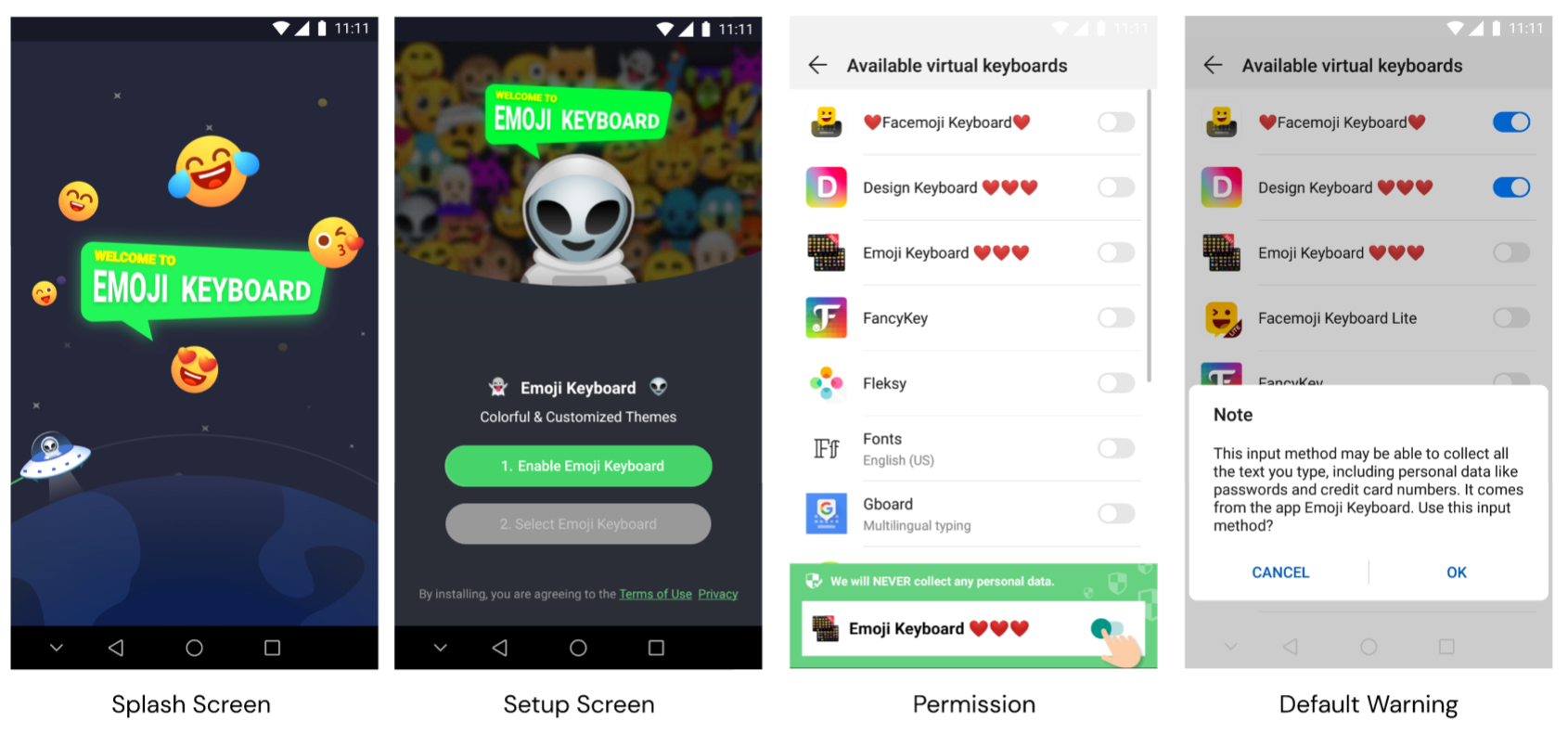
Users are worried about their privacy because when they enable our keyboard as new users, the default warning will pop up. It really affects the rating and satisfaction rate.

By simply telling our users we are safe when they are asking is not the solution to their needs. We need to have a better UX to represent our sense of security.
From researches and design audits, we found what our users actually WANT:
- A smooth and easy on-boarding process
- Seamless user experience throughout the app
Define success metrics
- Lower the # of negative reviews regarding privacy
- Increase NPS scores
- Increase the amount of time users spend on the app
This is a really big mission. And it takes more than a design team to achieve. That's why we looped in people from engineering, marketing, and product from Day 1.

First Impression is the Last Impression
Onboarding is one of the most critical phases in an app user’s journey. It is primarily the first point of contact and therefore is essential for making a great first impression. So it is important to make the process as simple and seamless as possible.


Design Option 1: Ask up-front & Ask in context
Before users enable the keyboard, a message will pop up and telling them we will not collect any personal information. User are more likely to agree to app permissions when they get asked during important tasks where permission is needed.


Design Option 2: Educate up-front & Educate in context
Before going to settings, we can educate user up-front in-app. During the on-boarding process, users get confronted with a lot of information. They can't possibly understand why they have to give us several permissions unless we explain it to them. So we add some informational words to request, explain the value and build up trust.

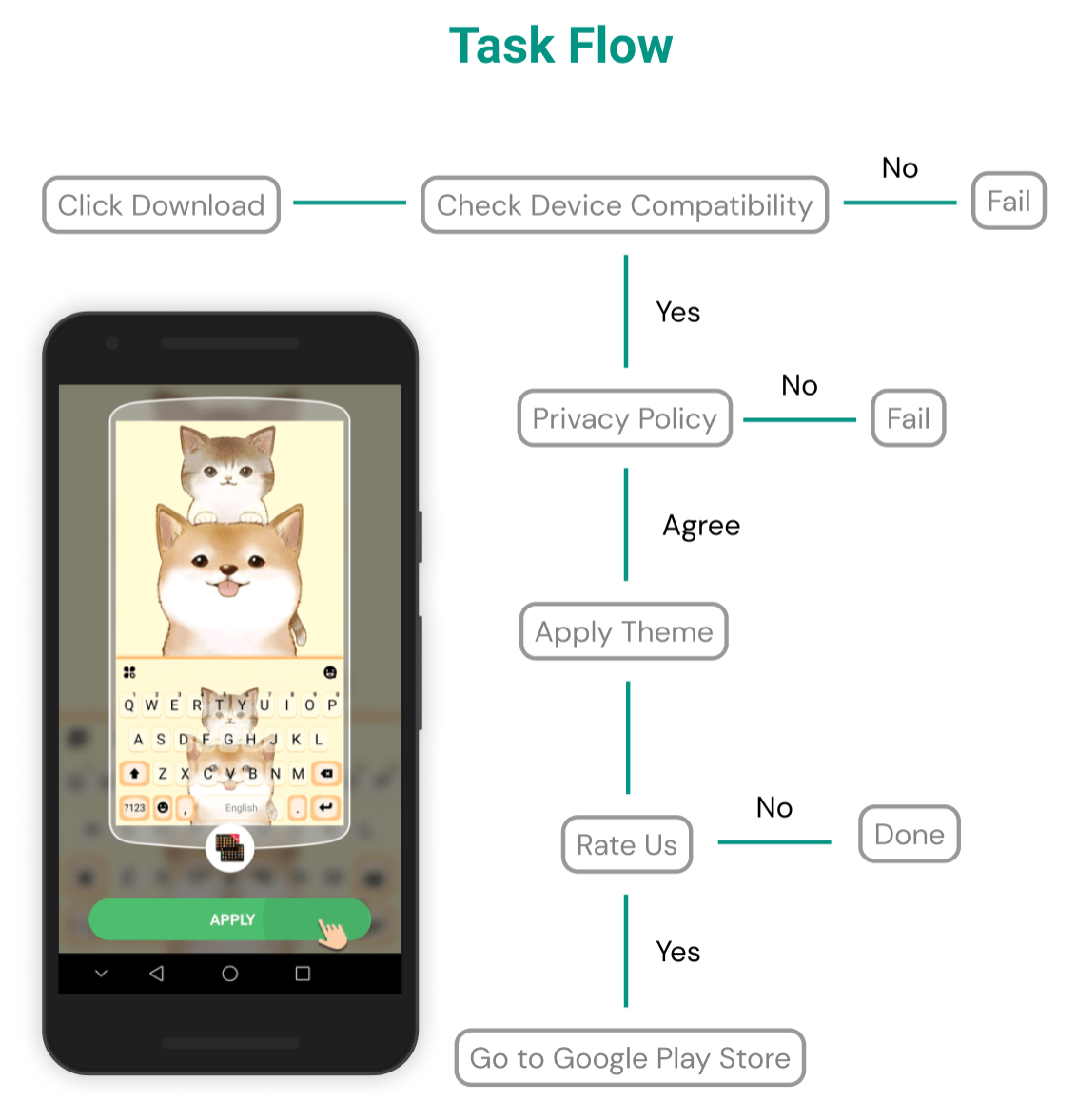
Ideal Flow

Trust is earned when actions meet words
In order to increase the ratings, we need to guide users when they’re comfortable and happy to give out reviews to build up trust. How does rating-guide drive user engagement? Exploring how to guide users to make good ratings and provide a happy path when downloading a new theme.
Applying new themes

Design Option: Always keep users informed about what is going on


Design Option: When to ask users to give out reviews?
User Scenarios: Meet Mia, who wants to download a cute kitty keyboard theme. After browsing thru the app, she finds one that she likes the most and decides to download it on her phone. The downloading process is quick and easy and Mia is very happy about her new keyboard theme. At this time a window pop-up and asking her to rate the app.


Designing a Localization-Friendly User Interface
KIKA and Emoji keyboards are available in more than 50 countries and we support 150+ languages. Localization is a complex work involving not just translation. As a bilingual designer working for a international product, I always put localization in mind when I am designing.
Different languages require different amount of screen space to display the same information.

Unfortunately, there isn’t an ideal font size that works for all languages across the globe. Our team want to maintain a globally consistent layout so we adopt a variable font size option to give a better user experience across languages and devices.

Takeaways
This project allowed me to practice critical thinking, attention to detail, and human-centered design thinking to consider all the useful features I could add to such a simple tool. I gave presentations at the end of every design stage, and I actively signed up for critiques or scheduled mock presentations with other designers in order to get feedback. Collaborating with engineering, I was able to learn how to consider edge cases.
In the end, I was able to deliver design solutions that are intuitive and functional. But No design should be the final design, we are still iterating on our products and seeking out for breakthroughs.
